Million Alimentos
Brand Identity
Visual identity made for a young and digital company, which feeds its audience with a regional classic.
Million Alimentos is a company that was born within a new movement in which young people are dominating the market with their identity, desires, and reflections on the future.
It is a small company, created by a young man of 24 years old, who grew up in the middle of corn plantations and wanted to have his own business. Million sells pamonha, a classic product from Goiás-Brazil, often seen with prejudice, as a simple business and country people. It was embraced by this young entrepreneur, who has been innovating in communication with his customers, who are engaging all moment on the internet.
Challenge
Create a modern and digital visual identity for a small and new business that sells a classic Goiás (Brazil) cultural product. Still, it always was a market that had a rustic look for young people from Generation Z, who are actively on the internet.
Criar uma identidade visual moderna e digital para uma empresa que trabalha com um produto que já é considerado um clássico na cultura do estado de Goiás, mas que tinha uma cara de rústico.
Solution
The solution was to follow what the internet offers us, with an identity designed to be in the digital, easy to adapt in applications, and talks directly to the generation Z.
A solução foi seguir o que a “internet” tem a nos oferecer, com uma identidade pensada para estar no digital, que seja fácil de se adaptar em aplicativos e que conversasse diretamente a geração Z.

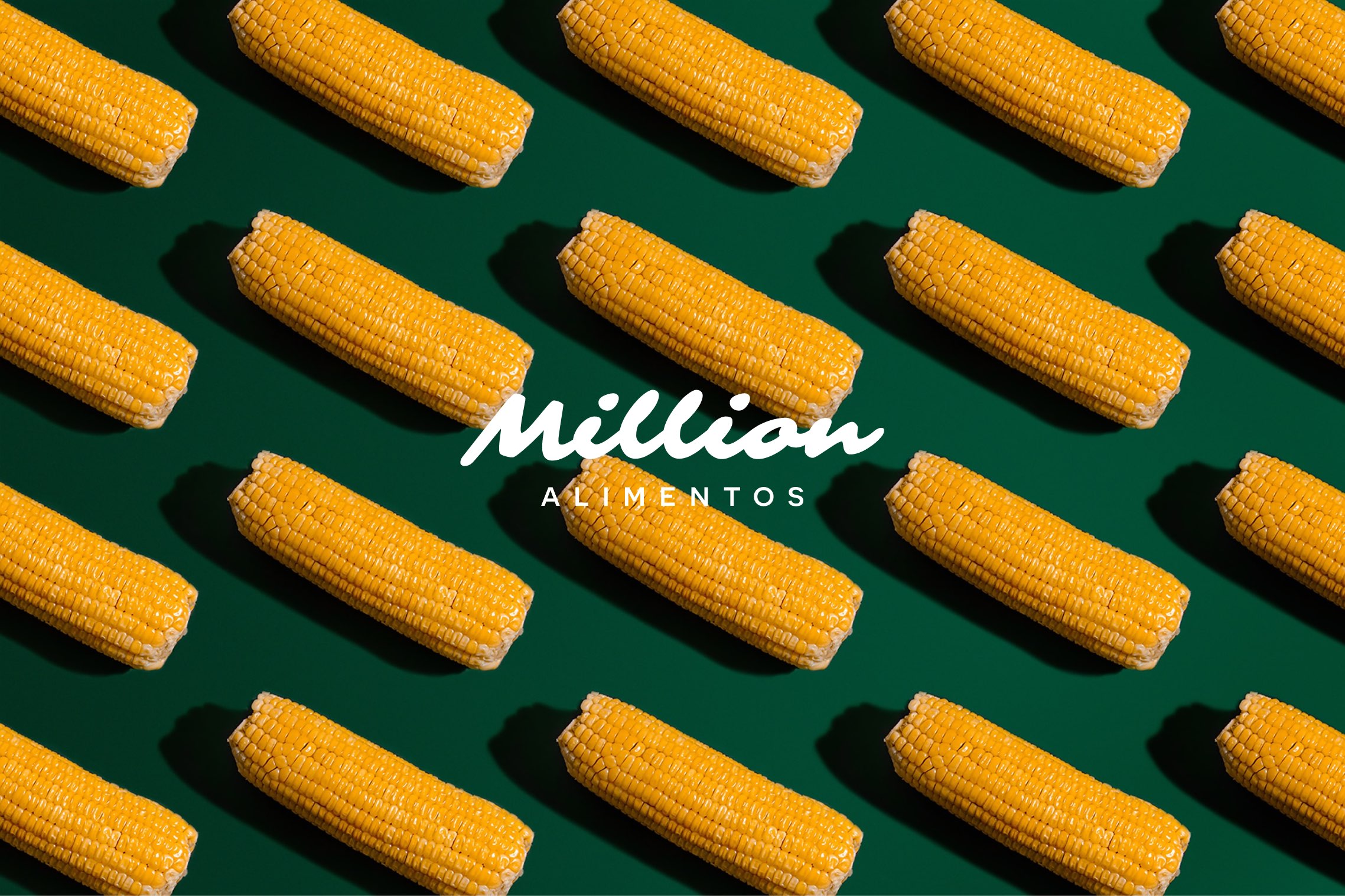
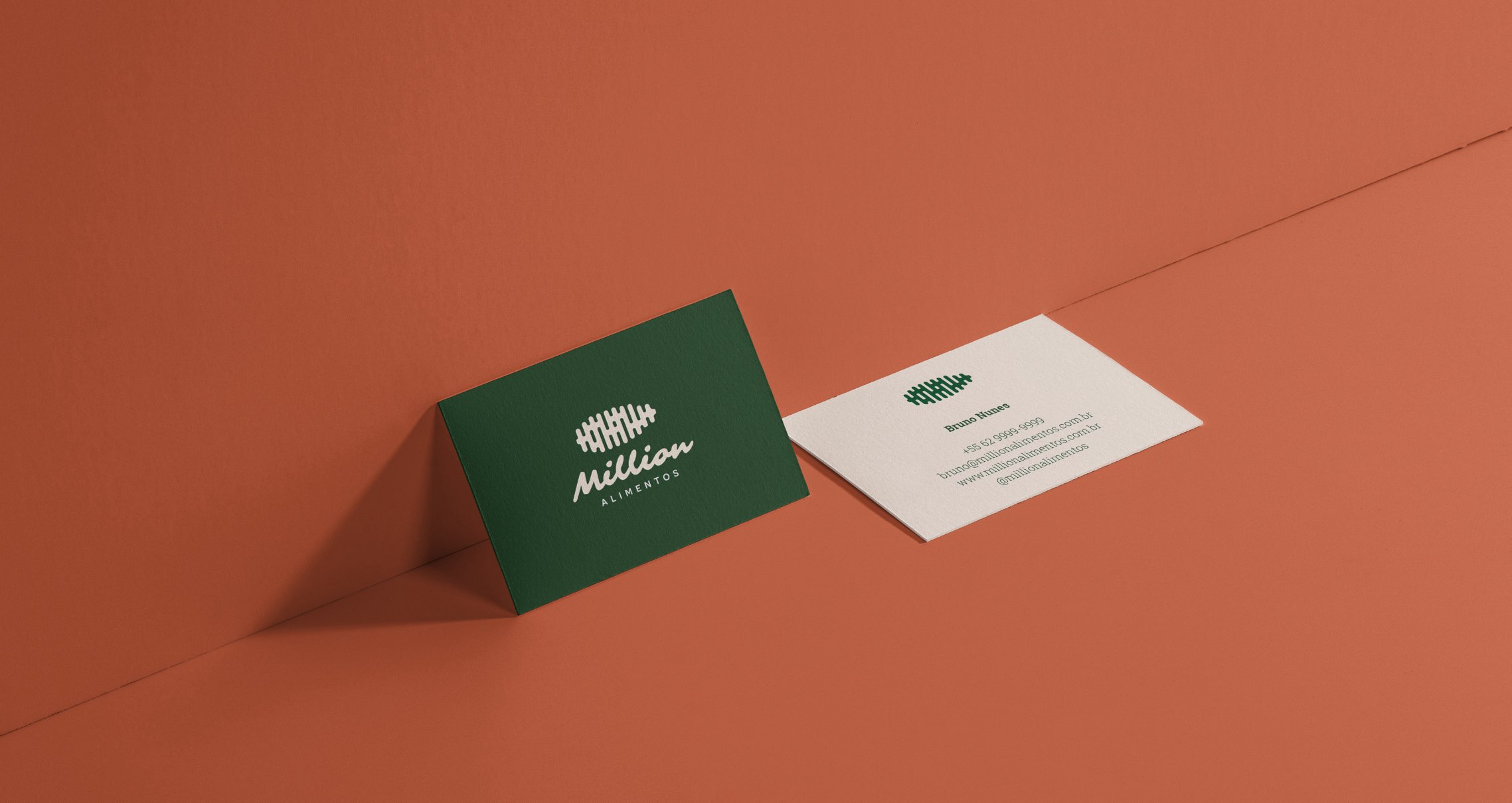
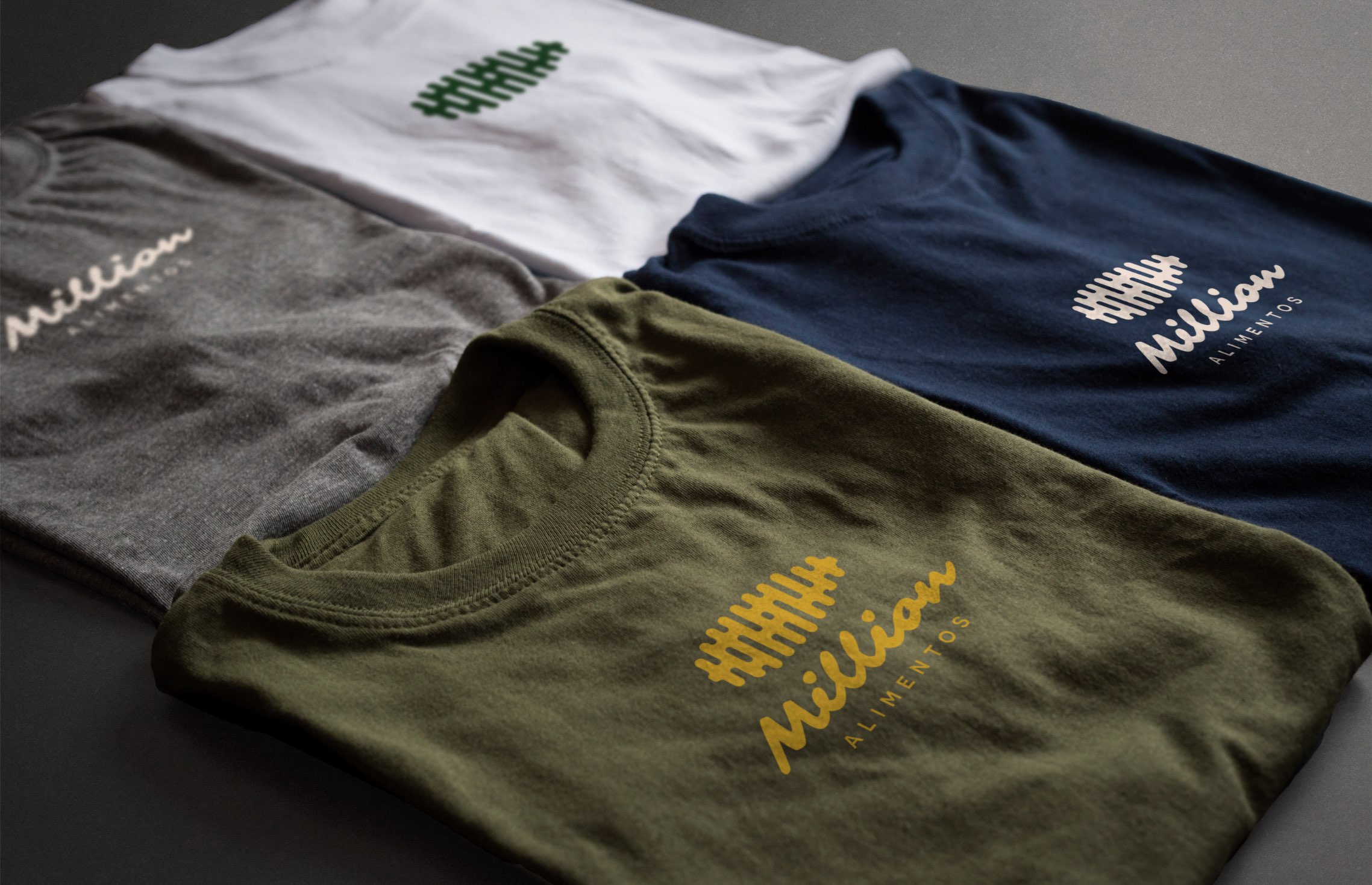
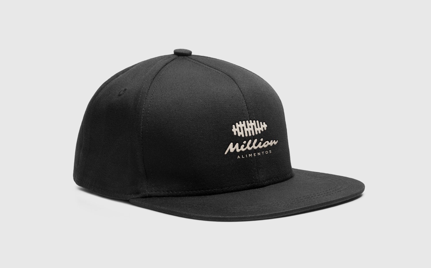
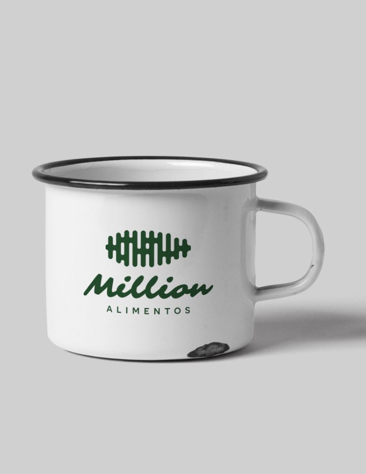
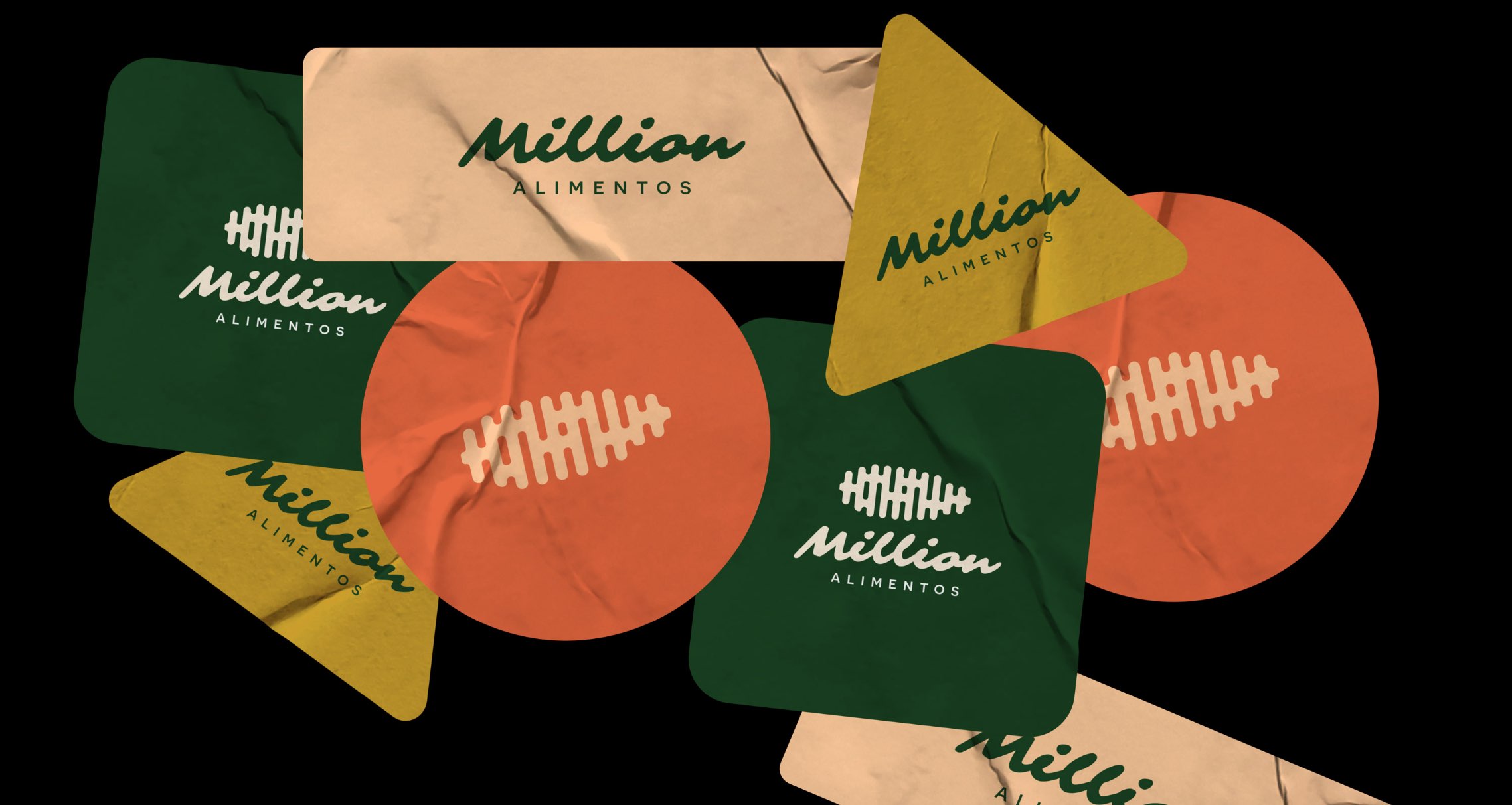
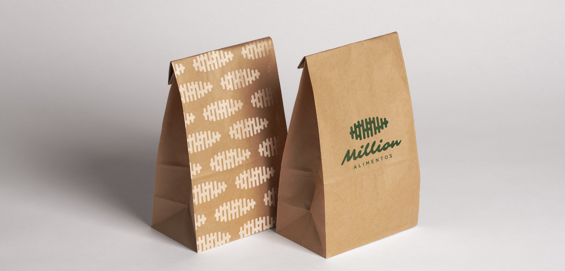
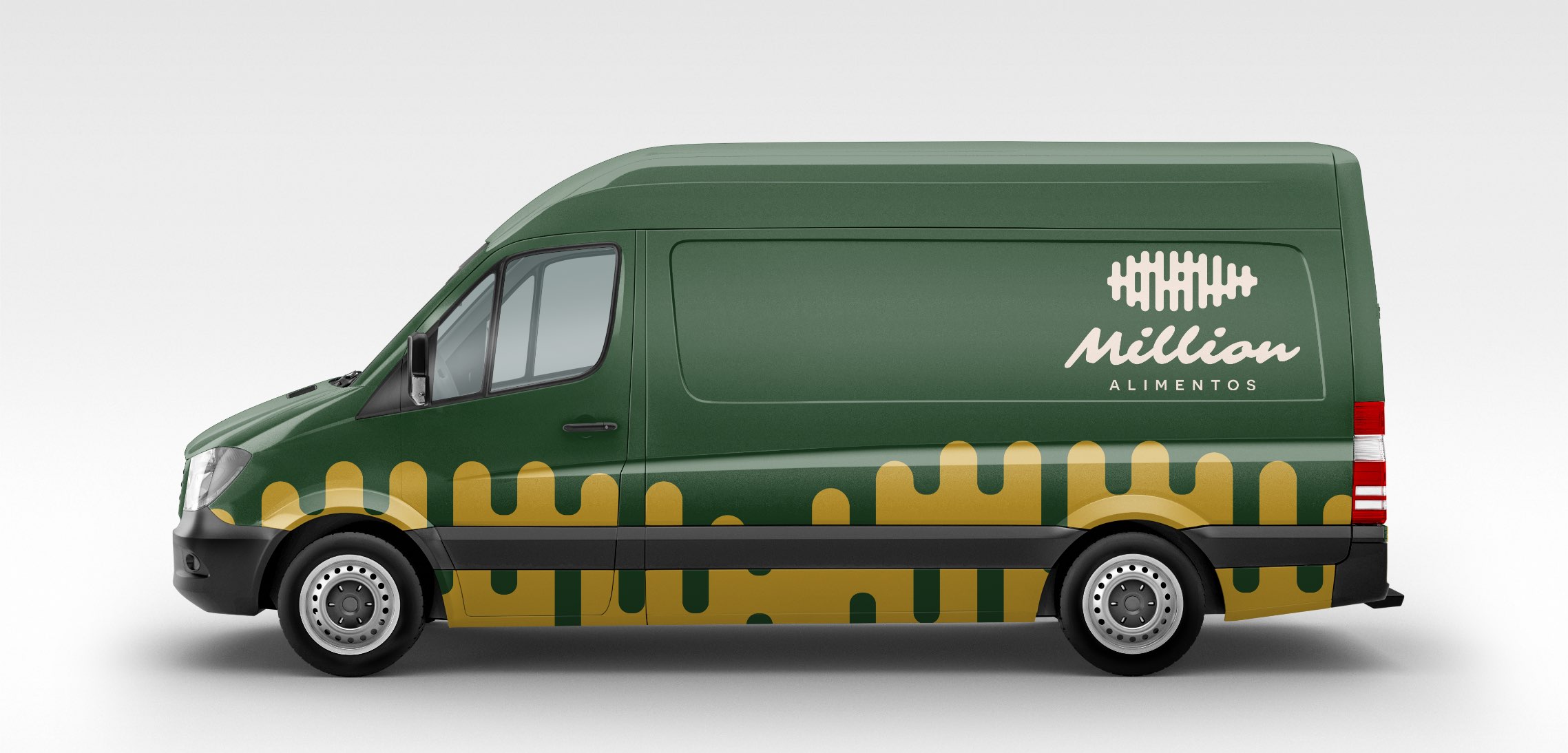
People who use this product expect dynamism and a closer relationship with the brand owner. The owner makes videos daily, interacts with the public, occasionally makes lives, and the visual identity was all about this behavior. The typography used, reminiscent of the corn mass, is the base of pamonha, the product my client makes, with viscosity and organic movements. The logo symbol follows the same organic idea of movement and a simplification of the ear of corn. The colors for this project were taken from the idea of corn, the dough that makes the product, and the audience’s youth, its target audience.