Mr Pistachio – Natural
Packaging design
Vibrant and functional packaging for healthy and good food.
Mr. Pistachio is a food and candy company based in Mexico. It was created by an American and is very successful, with spicy sweets typical of the region.


Challenge
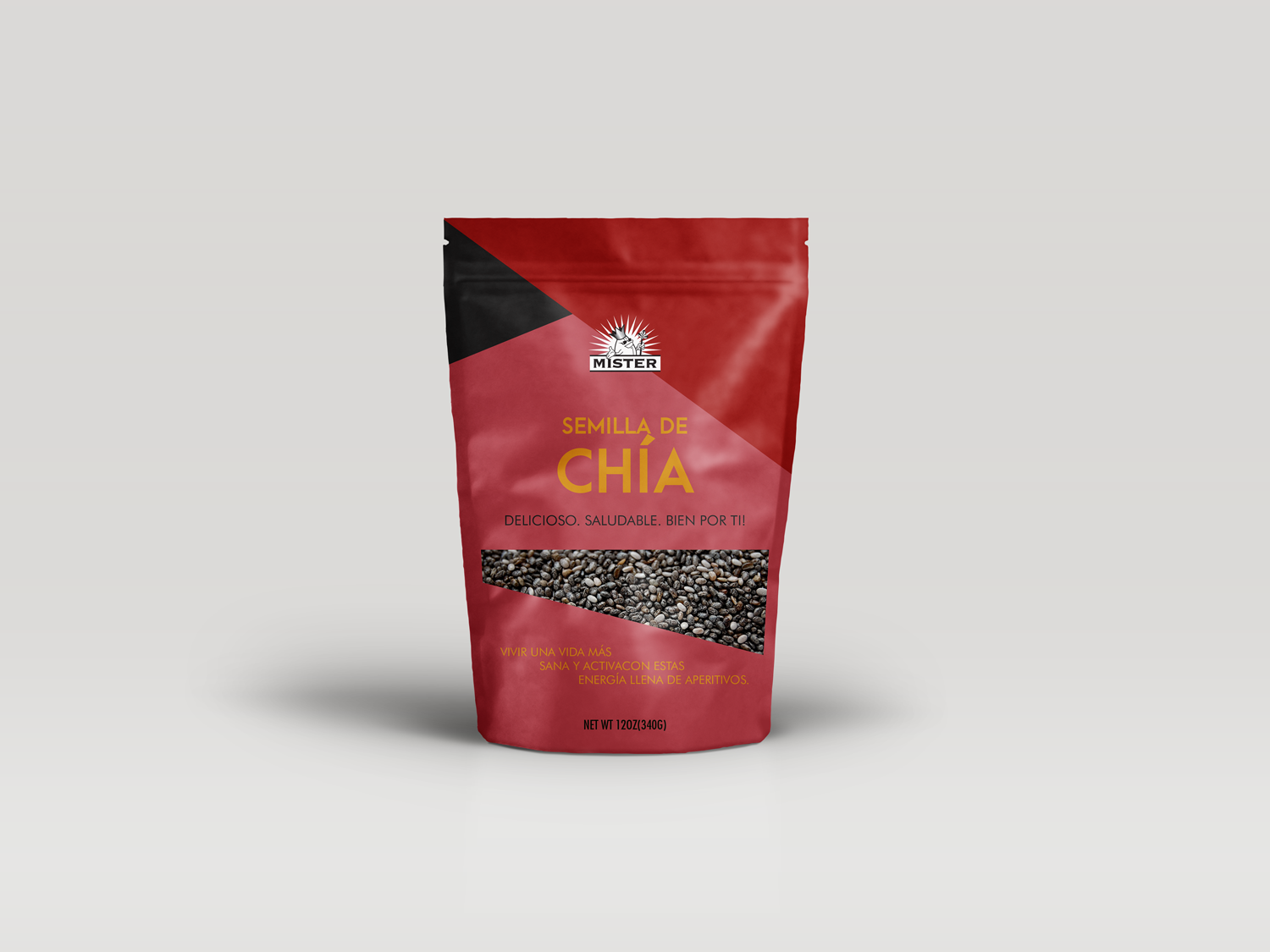
EN – The customer was looking to increase its product range and decided to make healthier line products, such as seeds and superfoods. The project was to create packaging for these new products, focusing on adults who are concerned with maintaining a healthy eating routine but who talked and did not lose the essence of the other existing products of the brand. PT – O cliente estava em busca de aumentar sua gama de produtos e decidiu apostar em fazer produtos de linha mais saudável, como sementes e super alimentos (super food). O projeto era criar embalagens para esses novos produtos, com foco em adultos que estão preocupados em manter uma rotina alimentar saudável mas que conversasse e não perdesse a essência dos outros produtos da marca já existentes.
Solution
EN – I created functional packaging so that the consumer could see the product through a window. I used vibrant colors, which already reminded me of the other existing products of the brand. These colors somehow spoke to the product in the packaging and made the whole identity of this product line more contemporary. The focus was to make the packaging fun but clean and with everything that matters most, useful information and visualization of the product. PT – Eu criei embalagens funcionais, que o consumidor pudesse ver o produto através de uma janela. Usei cores vibrantes, que já lembrassem dos outros produtos existentes da marca, e que essas cores de alguma maneira conversasse com o produto na embalagem, além de deixar toda identidade dessa linha de produtos mais contemporânea. O foco foi deixar a embalagem divertida, porém limpa e com tudo o que mais importa, informações úteis e visualização do produto na parte interna.